Tip: The paddock performance tool displays performance analytics of the property over time, including key metrics, yield over time and feed availability over time. This dashboard gives you critical insights into how your property is performing, allows you to spot trends and investigate observations you’re making in the field.
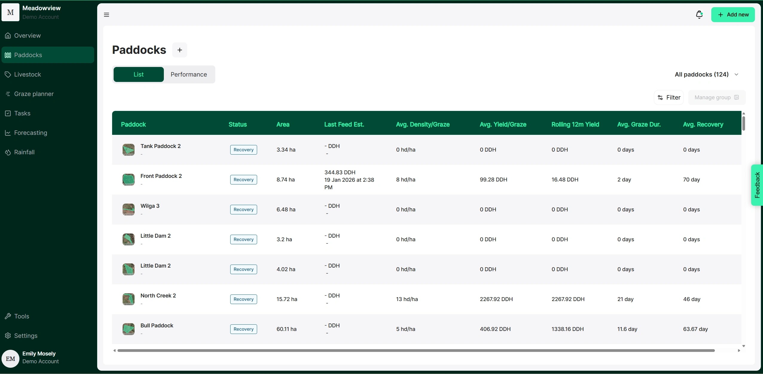
1. From the Paddocks dashboard, select the "Performance" tab.
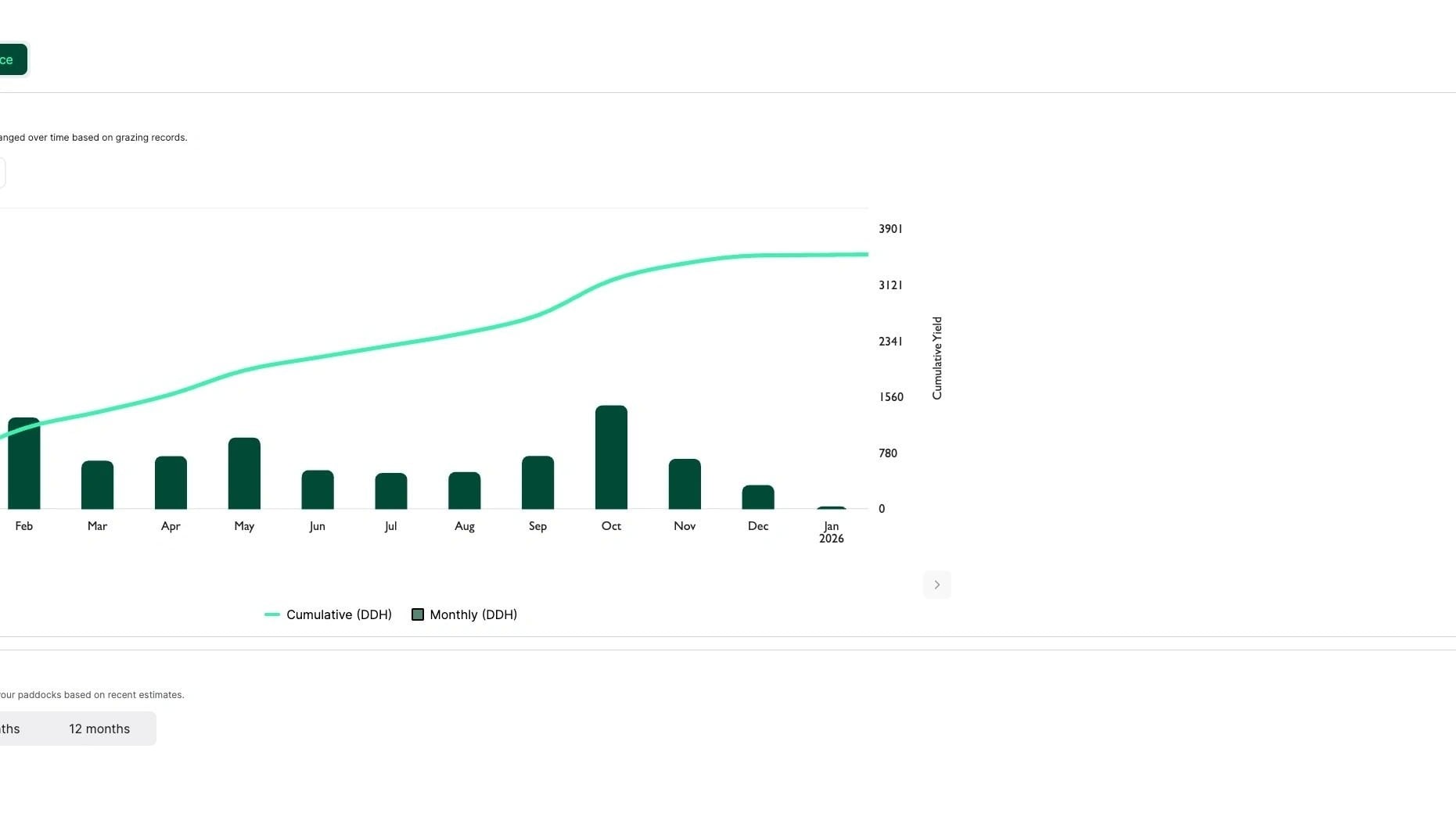
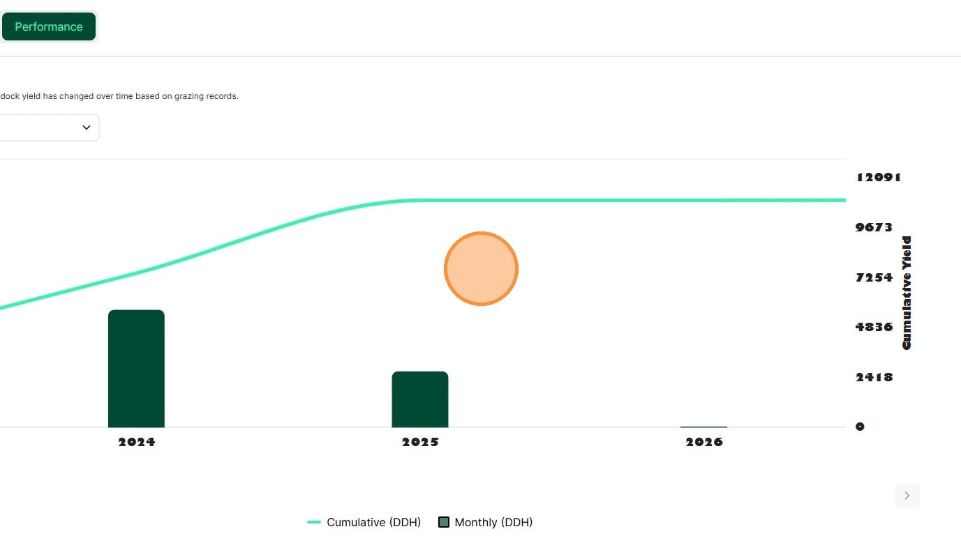
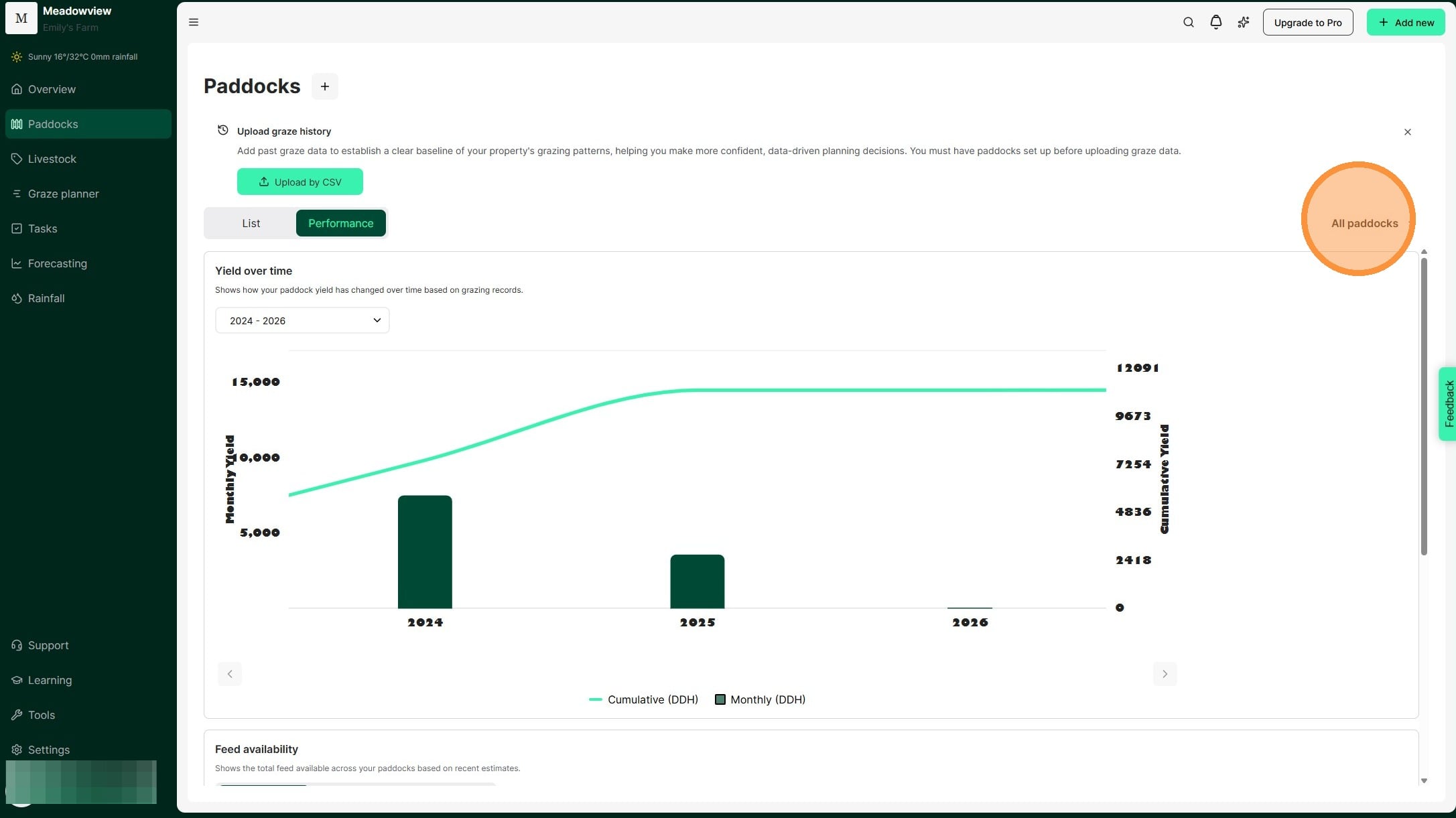
2. The Paddock Performance insights appear. The Yield over Time graph shows total grazing yield per month as bars and cumulative yield as a line.
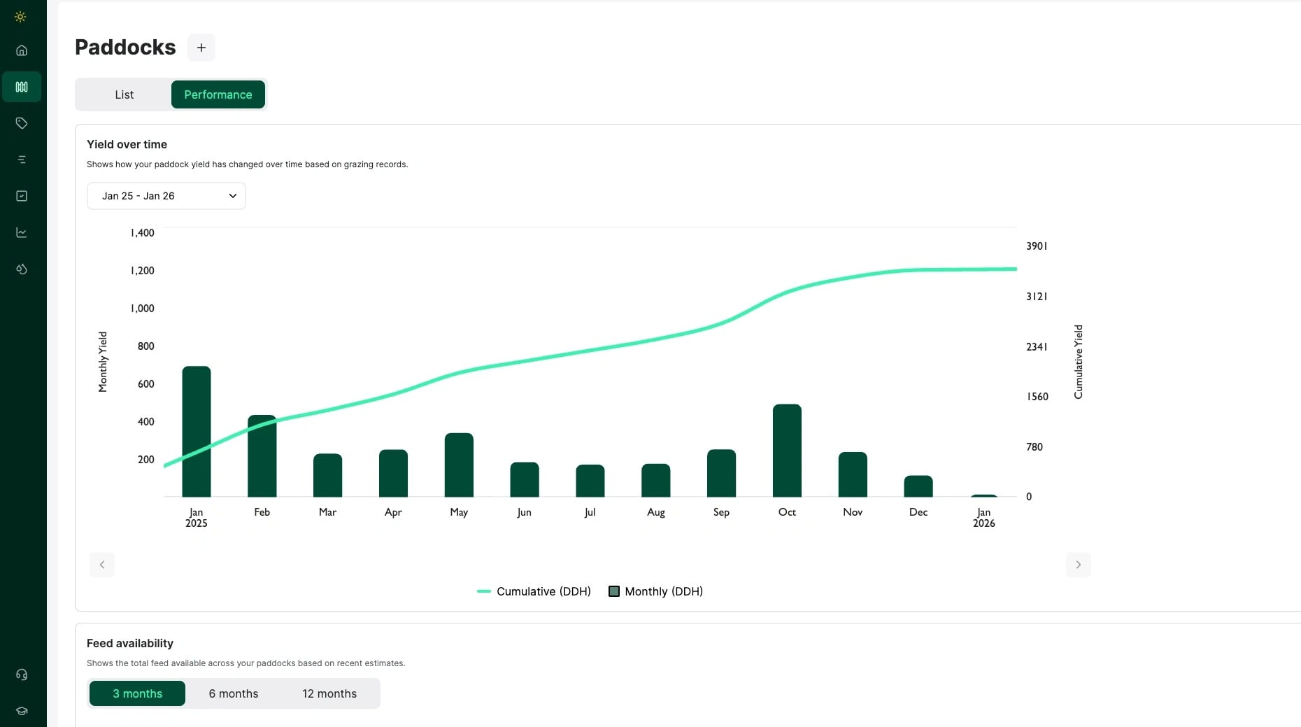
3. Change the date range by clicking the drop-down box to set your start and end dates. Then click "Apply"
4. Change the date range by clicking the drop-down box to set your start and end dates. Then click "Apply"
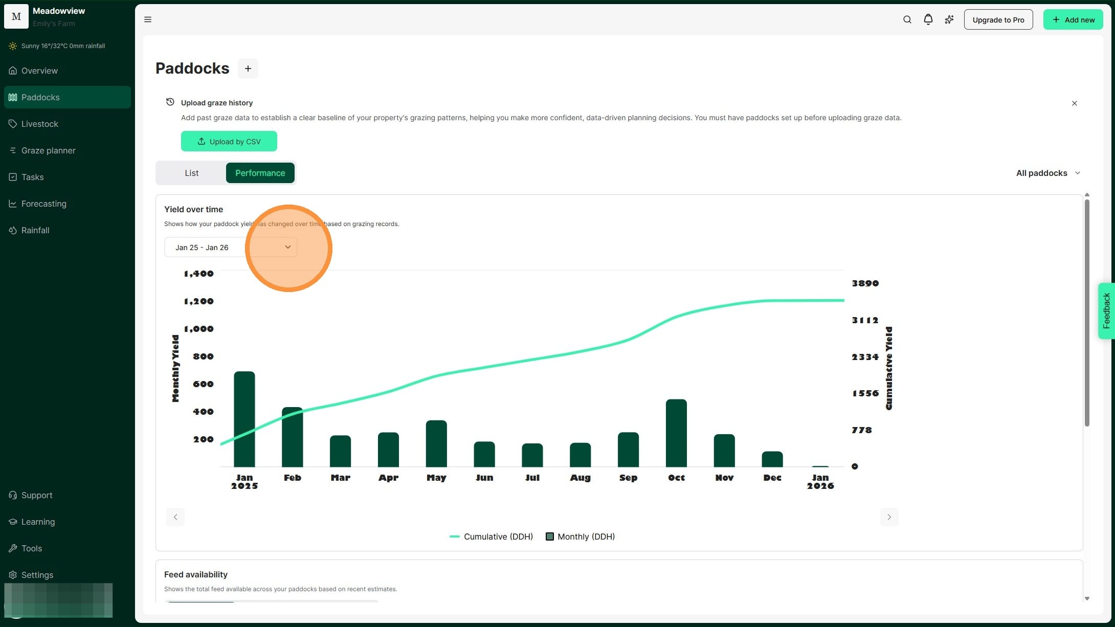
5. The graph shows grazing yield totals for your date range. Compare paddock performance across the period.
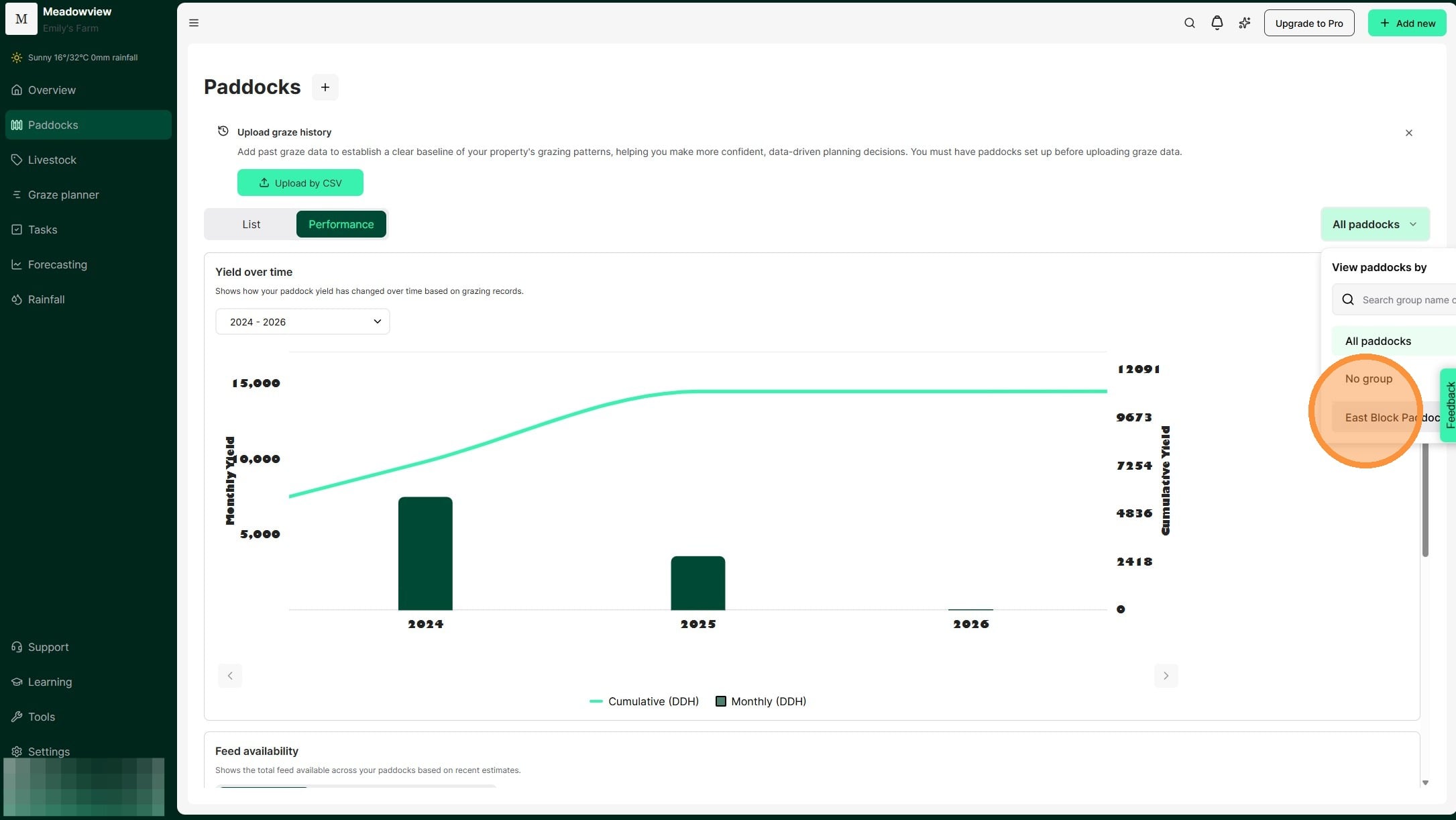
6. Click 'All paddocks' to select specific paddock groups. This lets you compare similar paddocks.
7. Select the relevant paddock group.
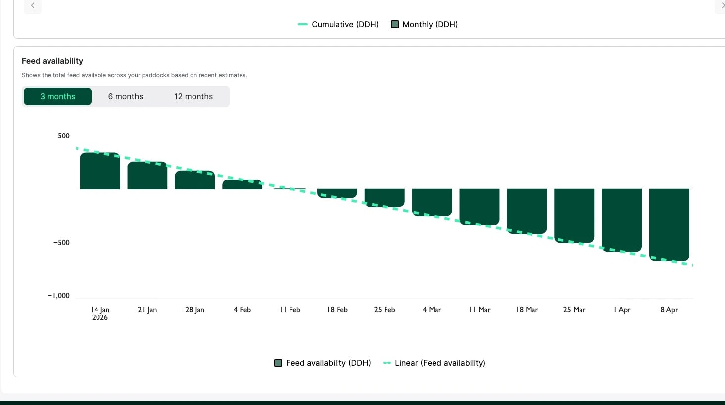
8. The Feed Availability chart shows available feed over 3, 6, or 12 months. Bars display total feed availability and the green dotted line shows the trend over time based on your current pasture and livestock inventory. When availability becomes negative, you have a feed deficit.
The feed availability chart allows you to predict the total burn down of your current feed supply.
Maintain feed estimates of each paddock to get quick insights on when your current feed supply will be depleted. Consider the time of year, rainfall conditions and your pasture burn down, to help determine when you might need to de-stock, or if you want to consider purchasing supplementary feed.