1. From the Home Dashboard, select the "Forecasting" tab on the side panel.
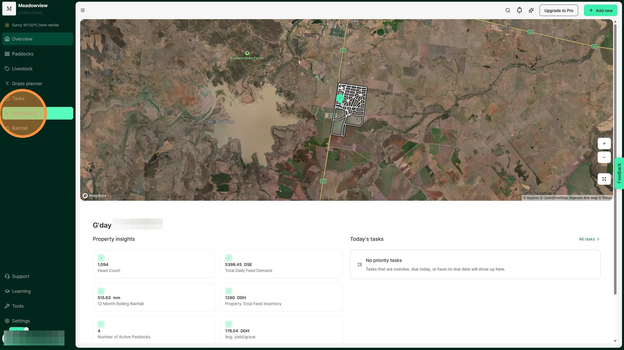
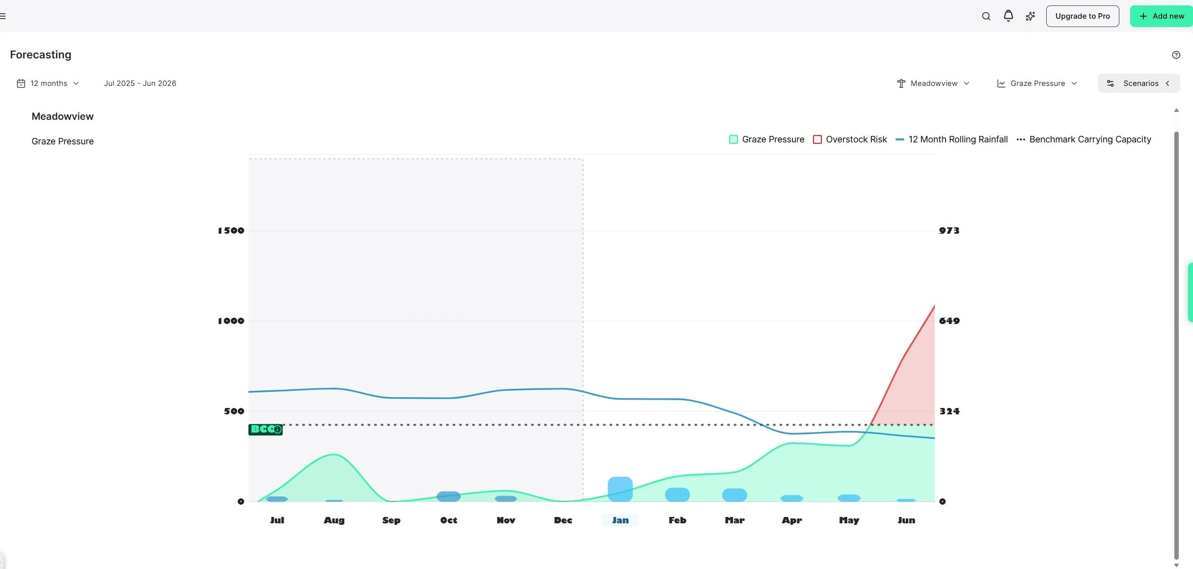
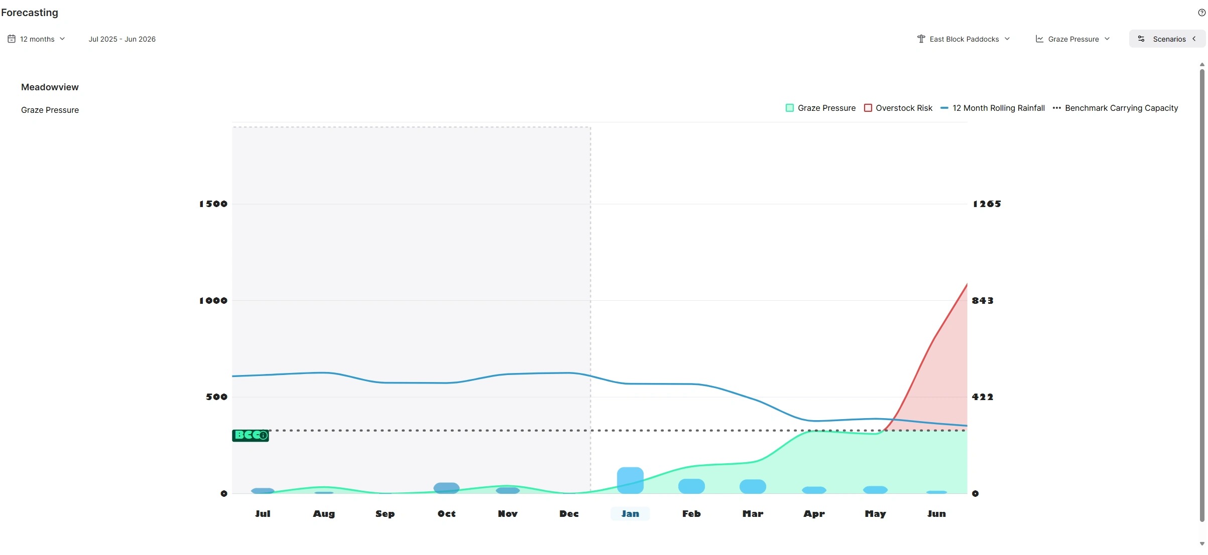
2. This will launch the forecasting graph. This chart represents your grazing pressure and forecasts your predicted grazing pressure given the trending stocking rate, and your long term average rainfall. It also compares your past actuals to help you identify when your land was at risk of stress from potential overstocking. It helps you understand your productivity and grass growth per 100mm or inch of rainfall.
By comparing your grazing pressure to your property's benchmark carrying capacity, this chart helps you spot when you're at risk of overstocking and running out of pasture supply.
In the below graph:
The forecast (or future) period is in white and the historic data in grey.
Dotted black line = Benchmark Carrying Capacity expressed as (DDH/100mm, SDH/100mm or ADA/inch). This represents the long-term average number of livestock that the property can comfortably support.
Blue line = 12-month Rolling Rainfall. This is the cumulative rainfall for the last 365 days, where past dates use the actual rainfall records and future dates use the long-term average historical rainfall.
Blue bars = Monthly rainfall totals.
Green/Red line = Actual Stocking Rate, expressed as stock days per hectare which represents the current feed demand. We compare this stocking rate to the benchmark carrying capacity to understand if we are in an understocking (below benchmark) or overstocking (above benchmark) situation. When you are below the benchmark carrying capacity the line will be green and when you are over, it will be red.
Tip: Keep your rainfall and livestock data up to date for the clearest picture of grazing pressure.]] [[This graph is best used for long-term averages, so the longer you maintain consistent records, the more insightful the data becomes on your property.
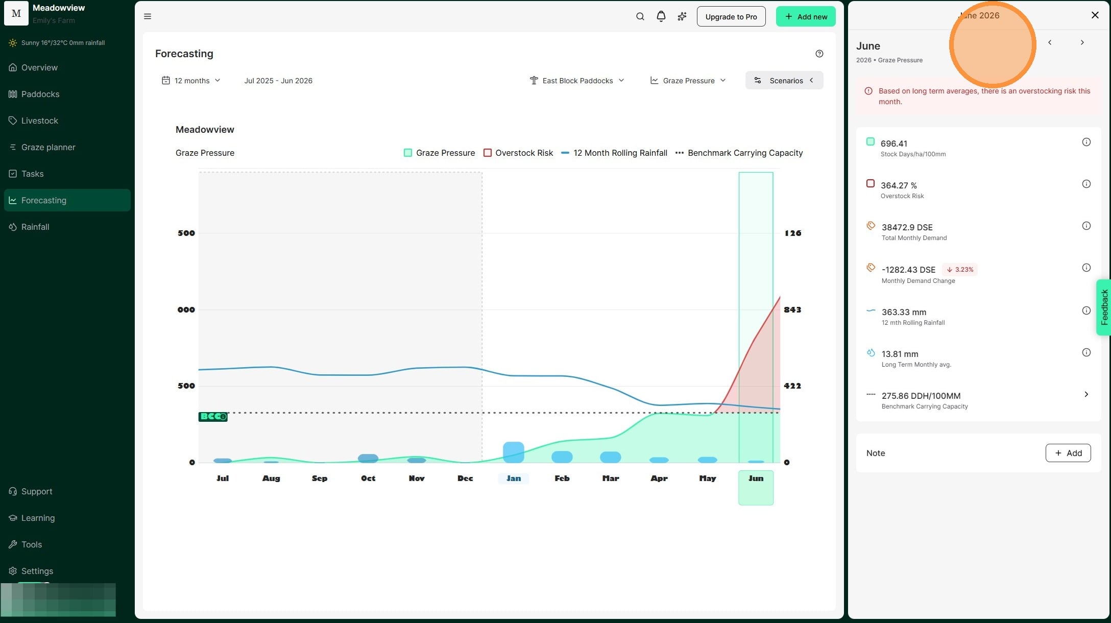
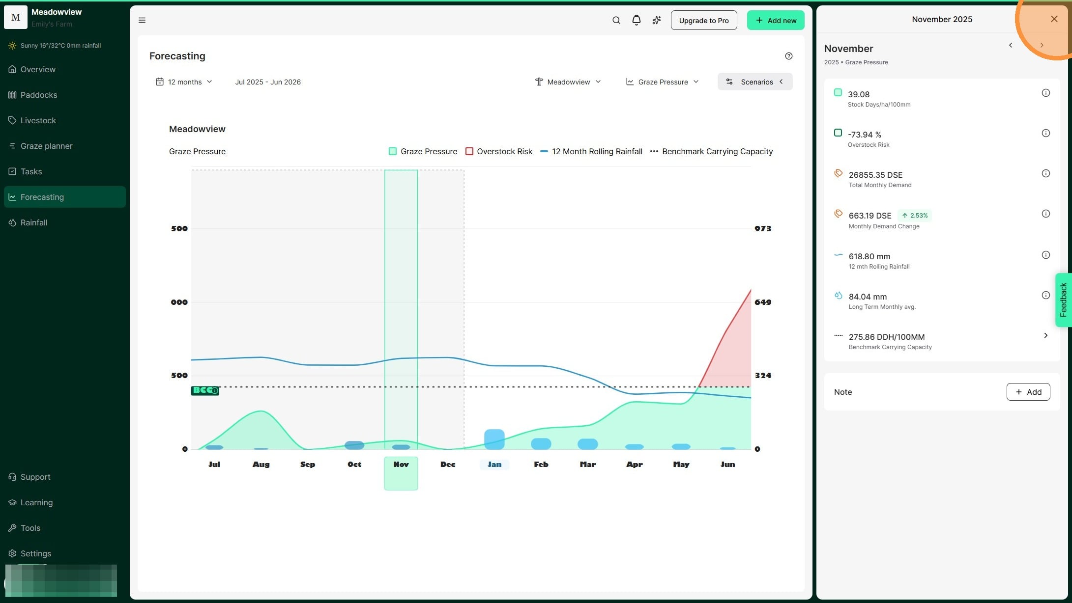
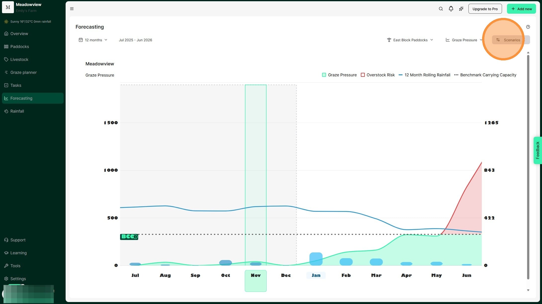
3. Select a specific month on the X axis to view the monthly details.
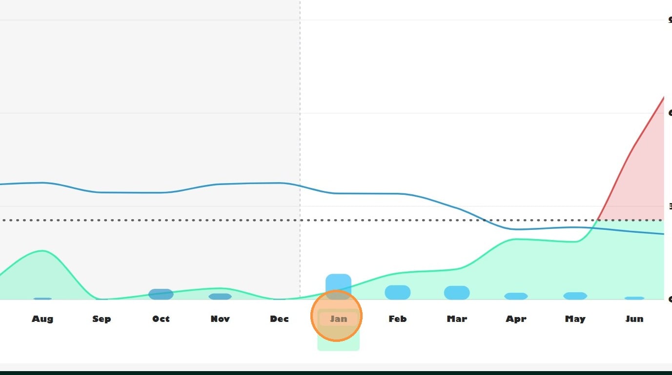
4. The month you select appears highlighted in green, as shown below.
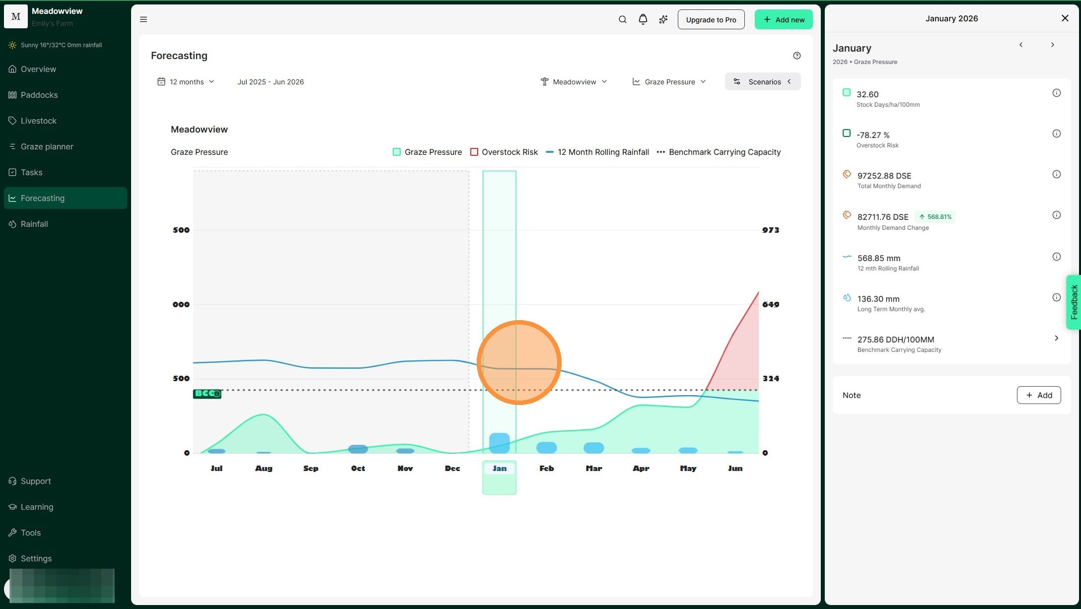
5. When you click a month it will open the side pane with a breakdown of the month's details.
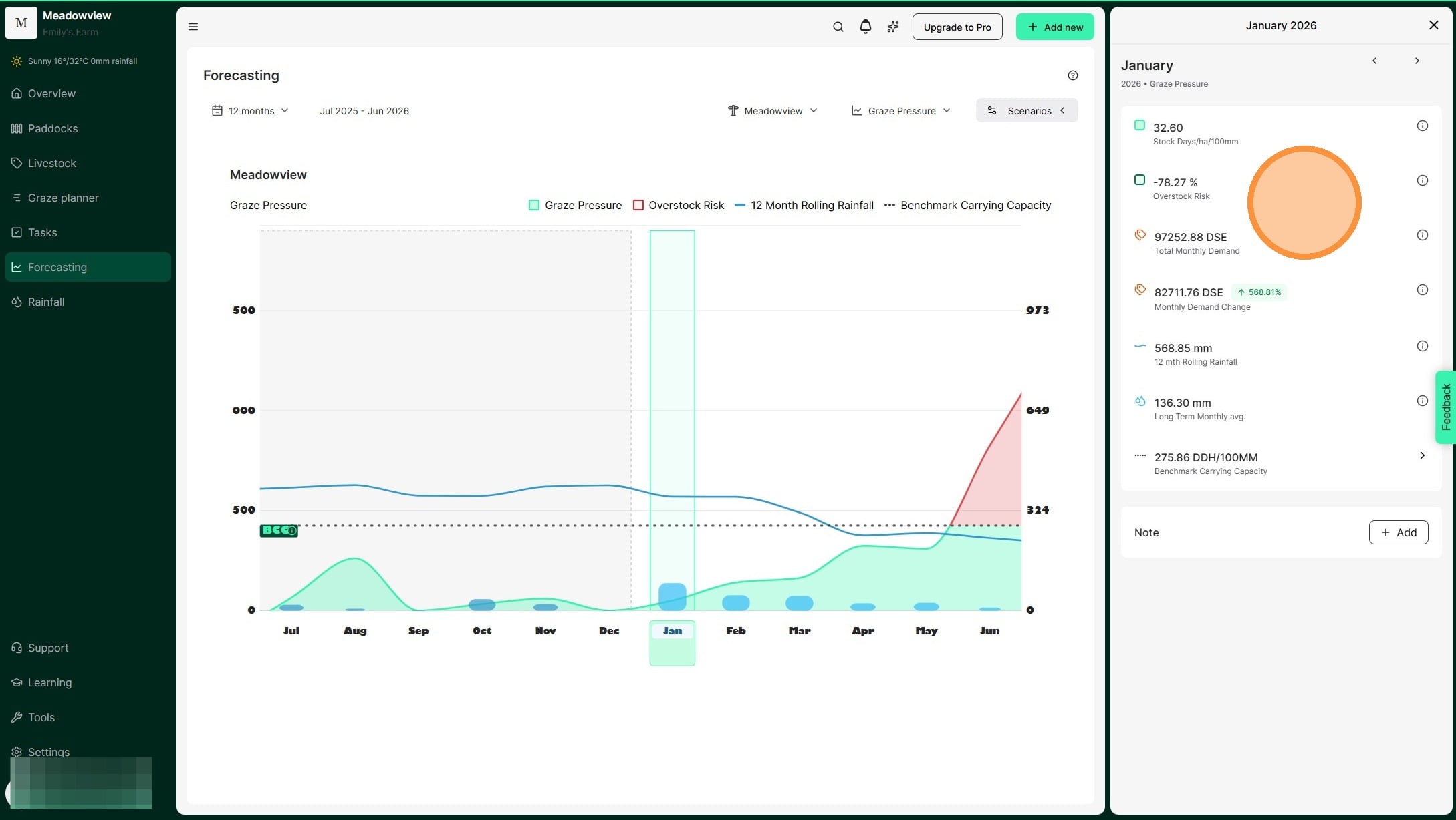
6. Select 'Add Note' to add a note for the month.
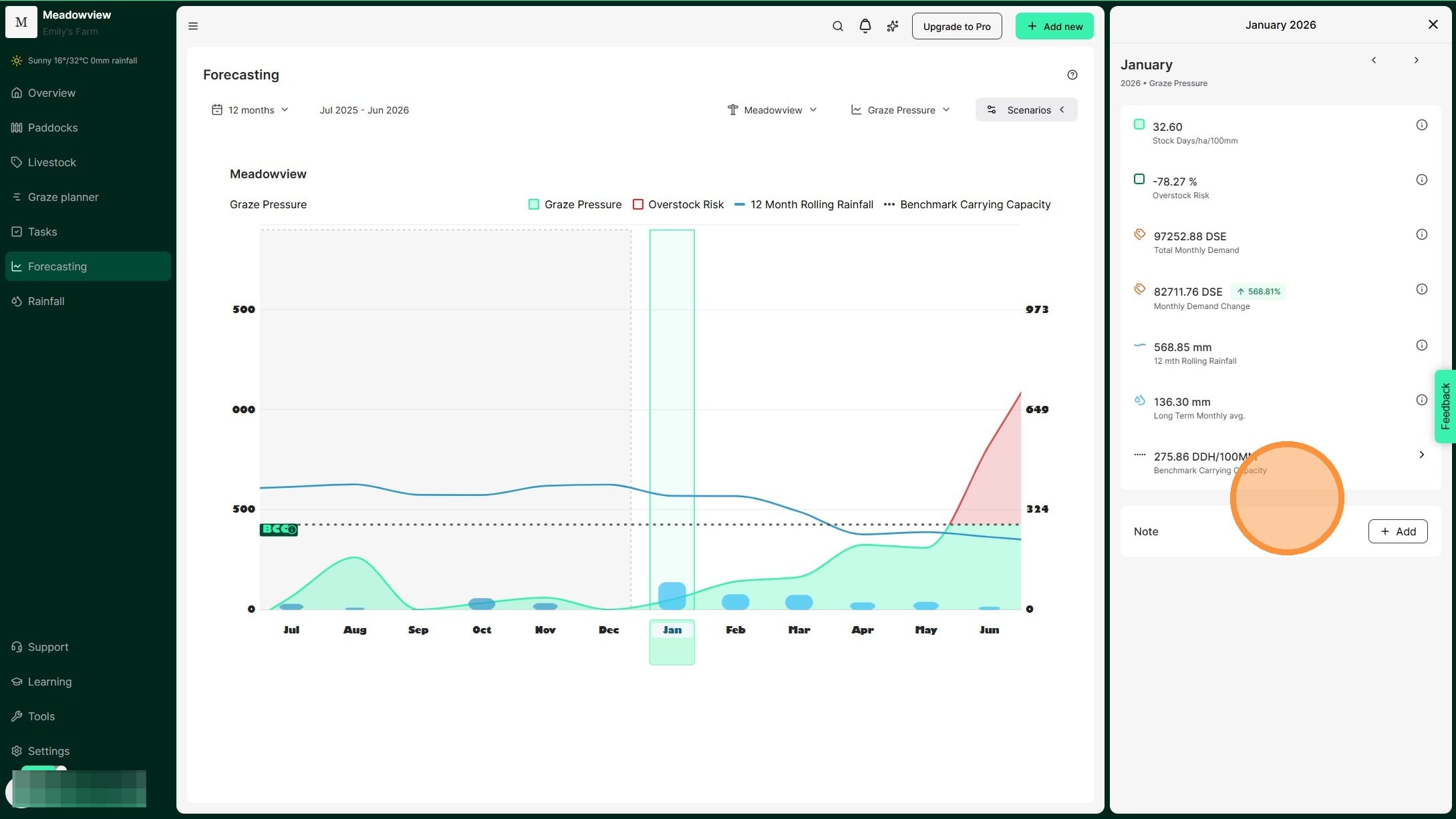
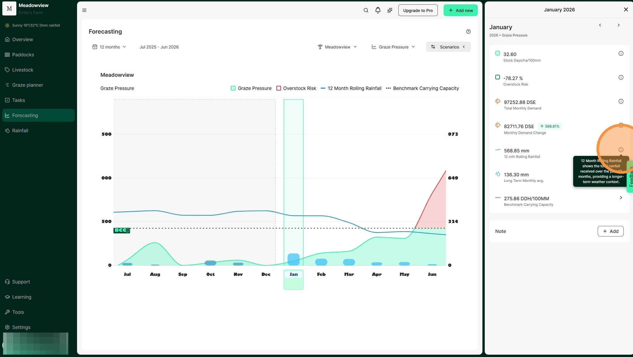
7. Tip: Clicking on the information symbol will bring up an explainer of each metric displayed in the monthly details.
An example of the further information provided for 12-month rolling rainfall.
8. Navigate between months using the forward or back arrow at the top of the panel.
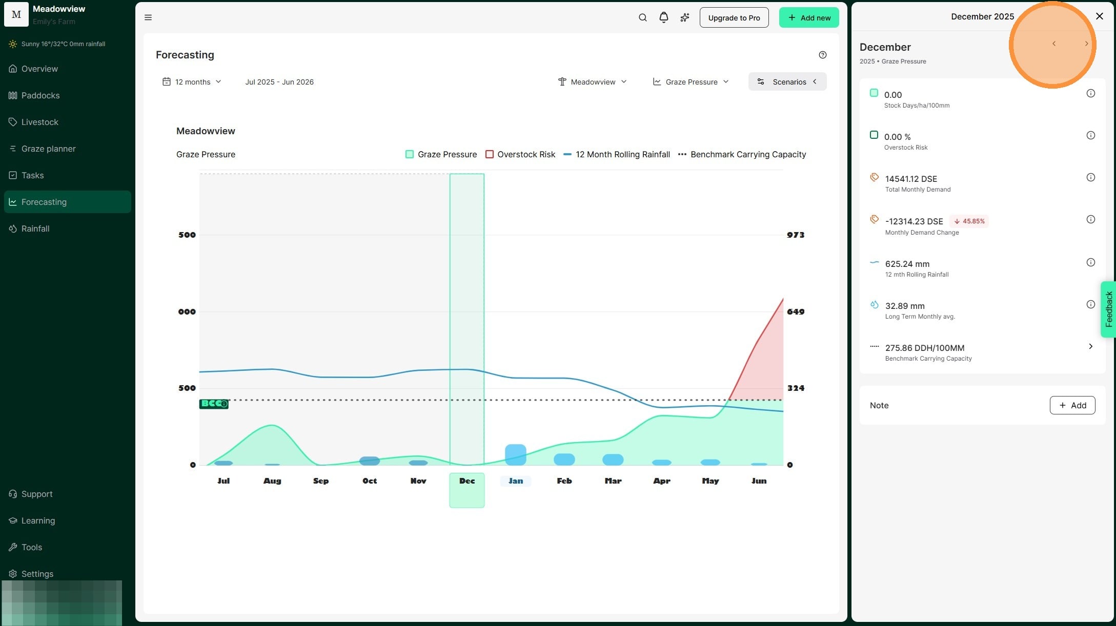
9. Click the forward arrow to view forecasted metrics for future months. We calculate the amount your SDH/100mm is over your benchmark to help measure how much risk you are carrying in your stock numbers.
10. Select "X" to exit the monthly view and return to the Forecast dashboard
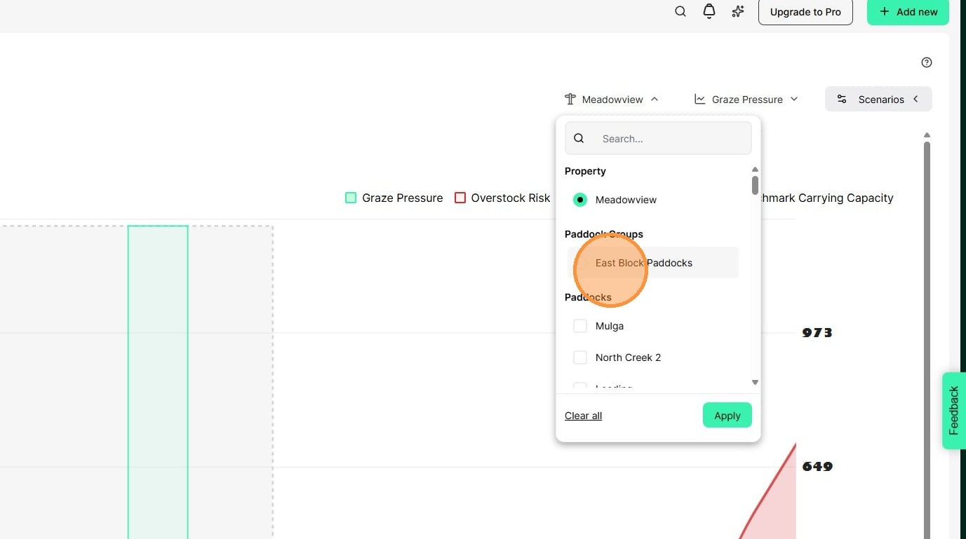
11. Use the filter icon at the top right to select which paddocks or paddock groups appear on the chart. Rainfall, topography and land conditions can be variable across large properties. Grouping paddocks with similar features allows you to more clearly analyse metrics and plan grazes.
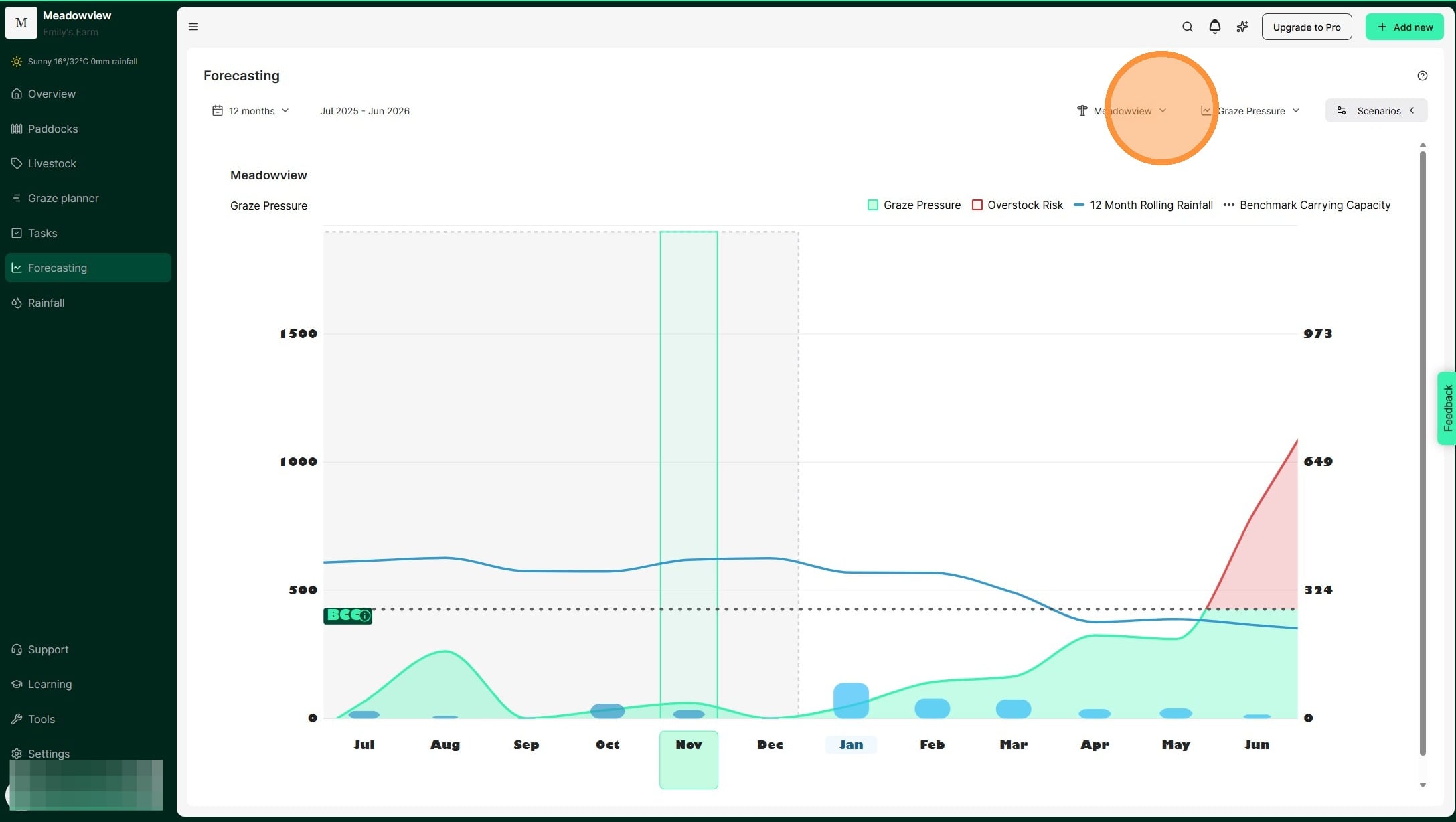
12. Select the relevant paddock or paddock group. Then select "Apply"
13. The chart displays only your selected paddocks or paddock groups.
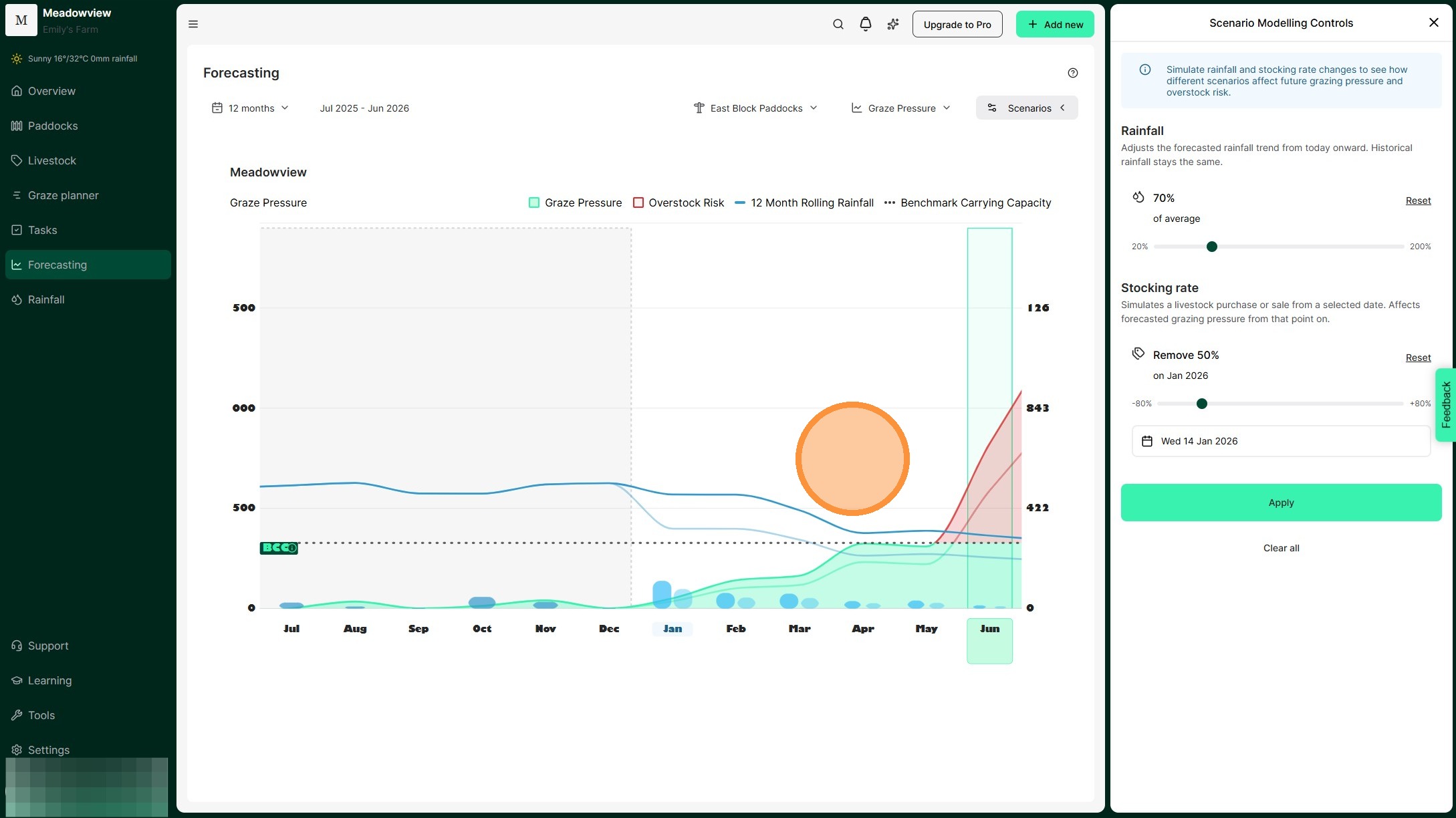
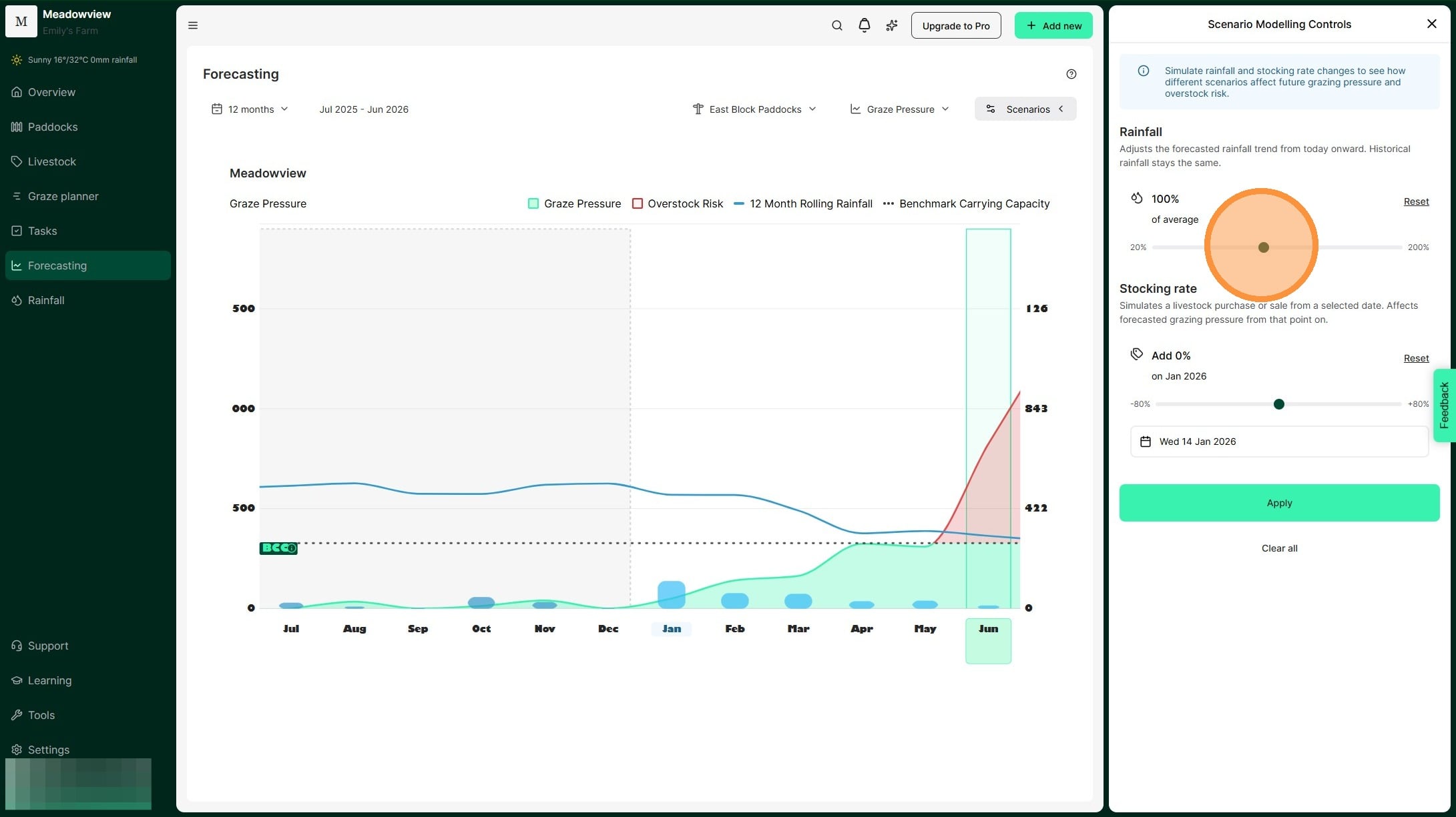
14. Test seasonal scenarios in the Graze Pressure chart by selecting 'Scenarios'. Adjust rainfall and stocking amounts to see how they will affect grazing pressure.
15. The Scenario Modelling Controls window will appear, where you can adjust rainfall and stocking rate for a specific date.
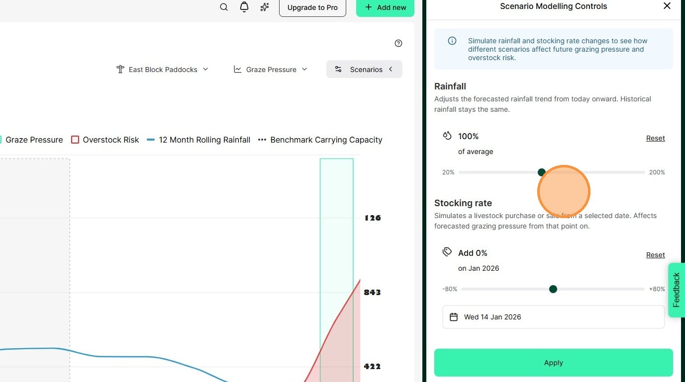
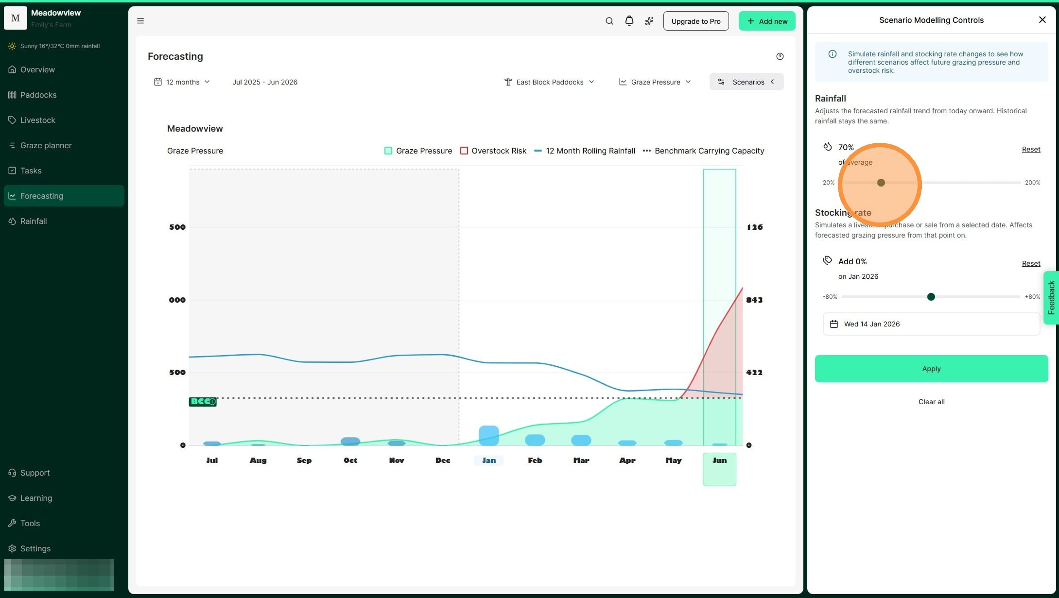
16. Move the slider to change expected rainfall. The percentage shows rainfall compared to the long-term average. This allows you to model either a surplus or deficit of rainfall to forecast the impact on feed availability and plan stocking decisions accordingly. For example, if summer is your non-growing season you may scenario plan for 70% and 50% so that you are prepared to manage through any outcome.
17. For example, in this scenario, we are decreasing expected rainfall by 70%.
18. Move the second slider to change your stocking rate. This simulates adding or removing livestock. Using the scenario of receiving 70% of our average rainfall, we can see that there is a 30% overstocking risk. This helps us to model the amount of demand we need to destock and mitigate the risk of overstocking.
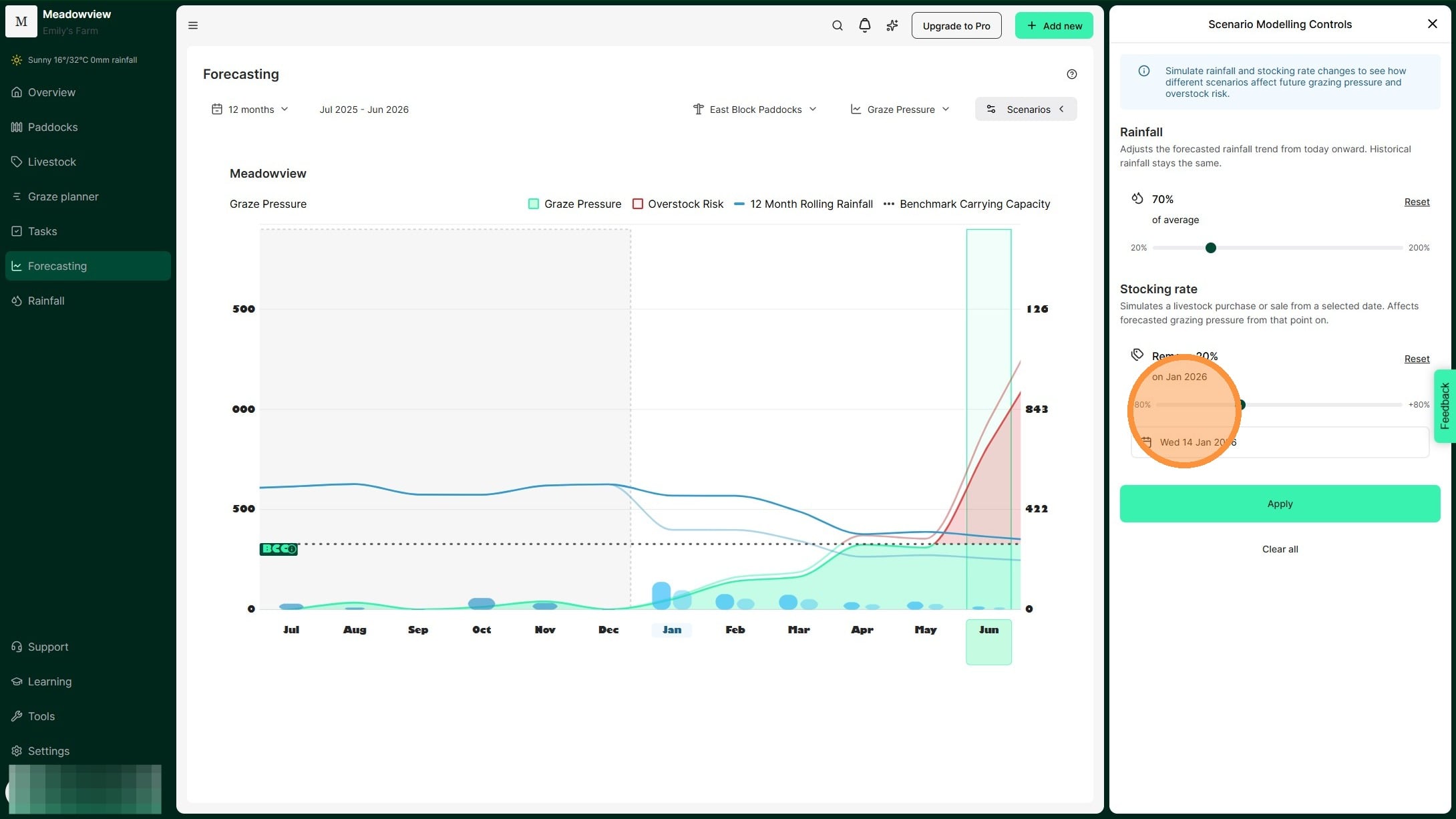
19. For example, in this scenario, we are reducing the stocking rate by 50%.
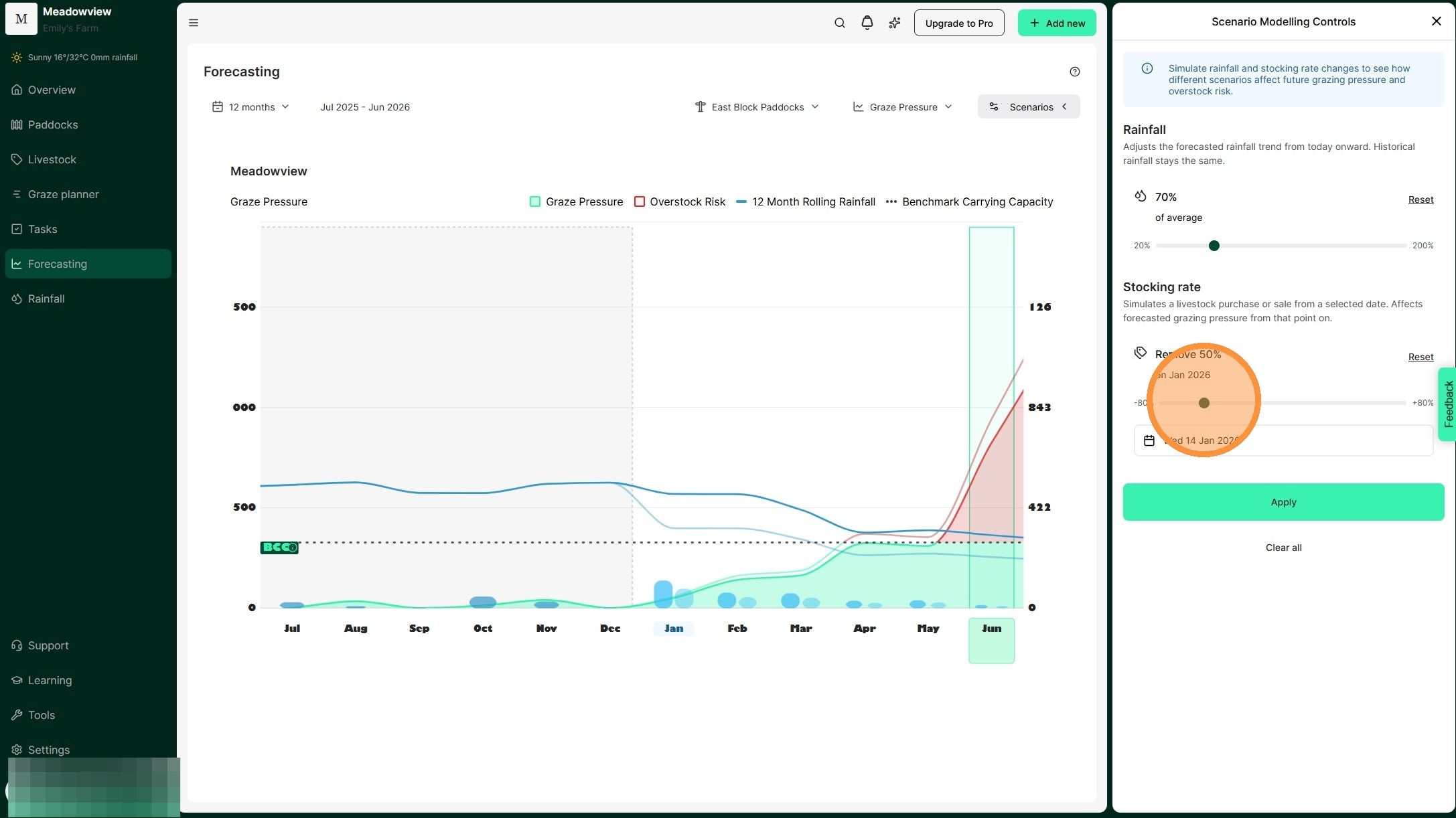
20. Select "Apply"
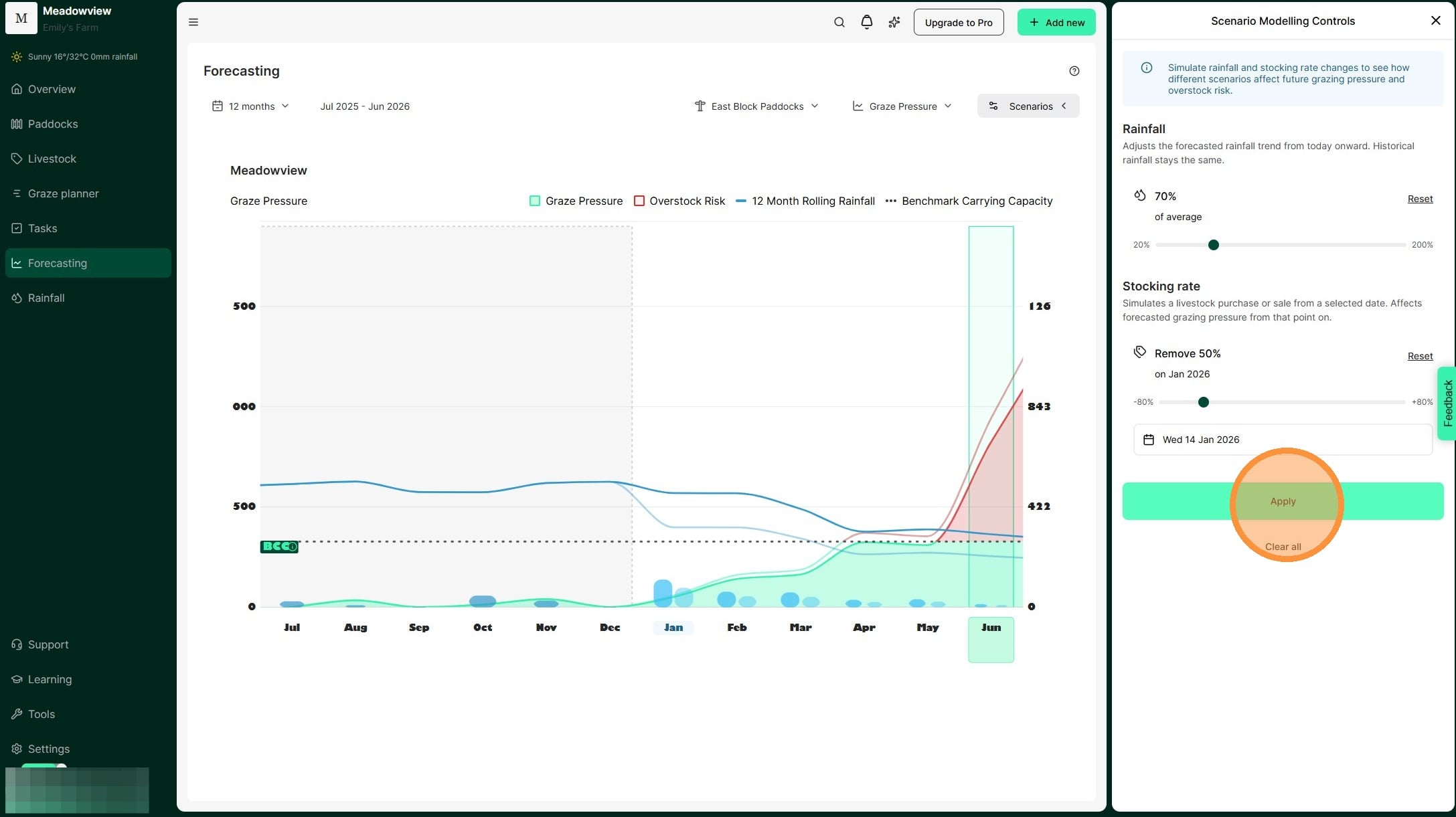
21. Your scenario now appears on the Graze Pressure chart.We can see the impact of rainfall received and our stocking rate decisions modelled by the lighter blue and green/red lines.
This tool allows us to "model" seasonal scenarios and plan for the optimum time to adjust stocking rate. Ultimately, this means we can reduce the chance of overstocking and the impacts of extended dry periods.